KulturNavi supports stakeholders from culture, tourism, education, and related industries in strategically developing cultural initiatives and making them effective. As a strategic cultural partner, KulturNavi combines many years of practical experience with a broad network – from established institutions and associations to independent artists and cultural professionals in related sectors. At its core is the conviction that strong collaboration is the engine for sustainable development: recognizing potential, jointly developing ideas, and connecting stakeholders across disciplinary boundaries.
Category
Culture & Community
Service
Consulting
Conception
Logo Design
Corporate Design
Communication Design
UX & UI Design
Web Development
Partner
Background & Objectives
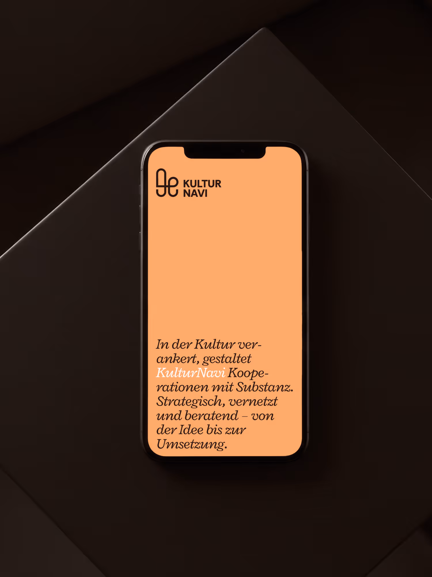
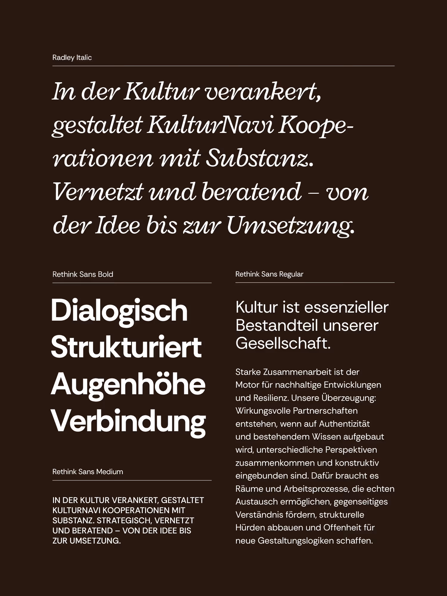
KulturNavi was established as a new consulting agency for strategic cultural work, which we had the privilege of designing from the ground up – including the brand name, logo, colors, fonts, and website. Working with Ladina Thöny, the key challenge was to address this: Culture is a complex and often intangible subject for many, as is the work of a cultural consultancy itself. The aim was a brand identity that clarifies the abstract services, highlights KulturNavi's clear processes, and generates attention for a new voice in the sector. The brand identity needed to be friendly and approachable, but consciously differentiate itself from typical consulting brands – distinctive, substantive, and collaborative.
Implementation & Value
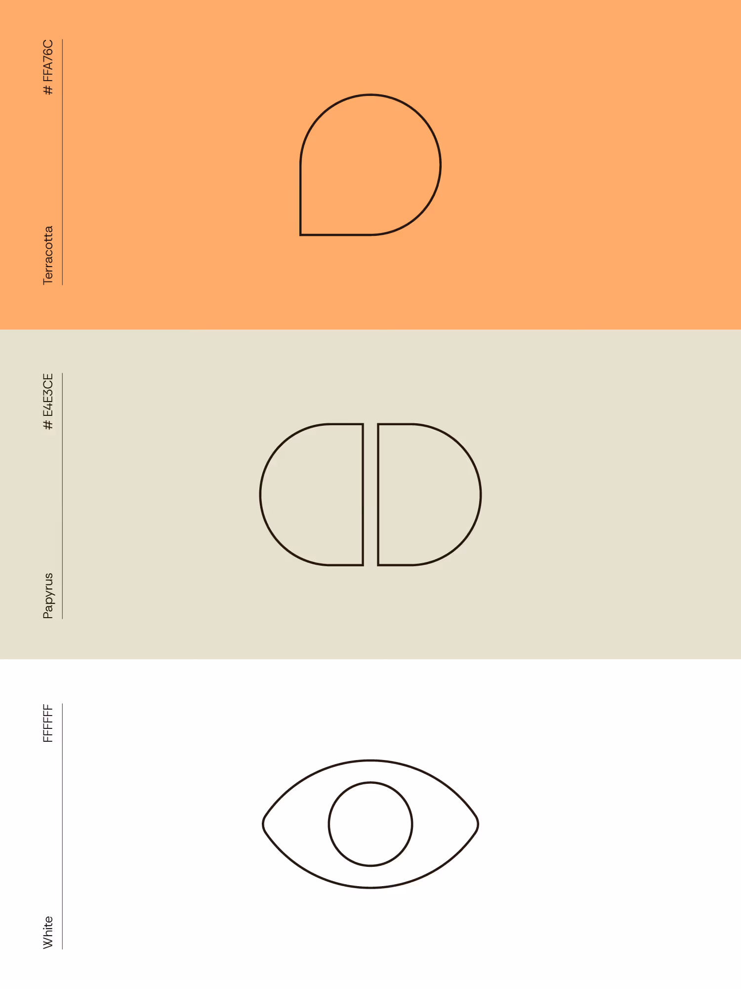
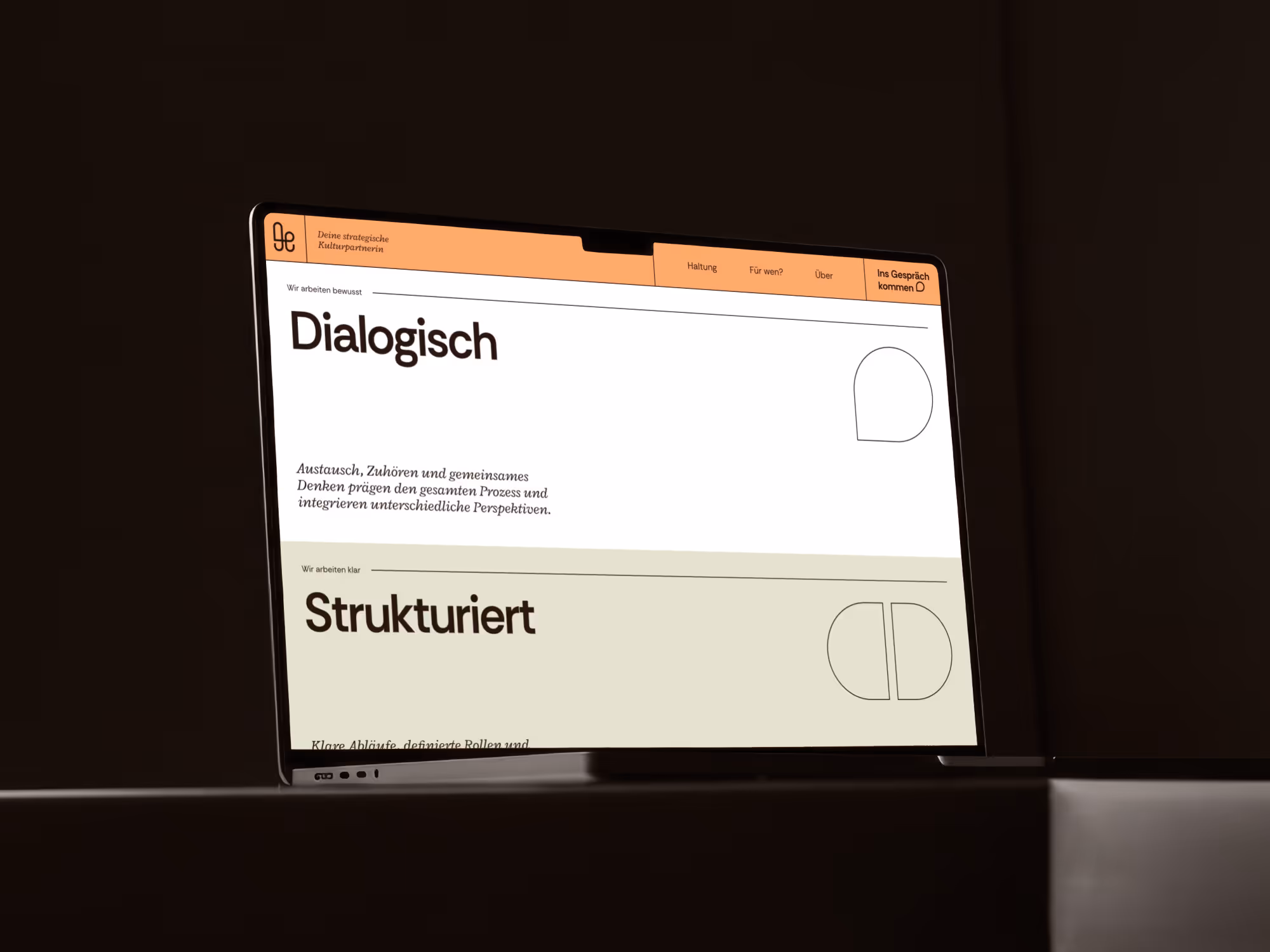
At the heart of the visual identity is a custom-developed emblem that perfectly encapsulates the essence of KulturNavi: a stylized 'k' formed from the four core concepts – Culture, Conversation, Connection, and Navigation – uniting them in a single form. A series of additional icons are derived from this symbol, each making one of the four pillars tangible and illustrating KulturNavi's approach step by step. The visual language deliberately employs minimalist means: fine lines, clear shapes, and a calm, warm color palette create a presence that is both playful and professional. The website consistently follows this principle. A clear structure guides visitors through our philosophy, services, and target groups, making the consulting process transparent. Instead of relying on imagery, we focus on typography, color, and iconography as core design elements. The result is a brand identity that brings the somewhat abstract topic of culture to life: accessible, distinctive, and substantial.