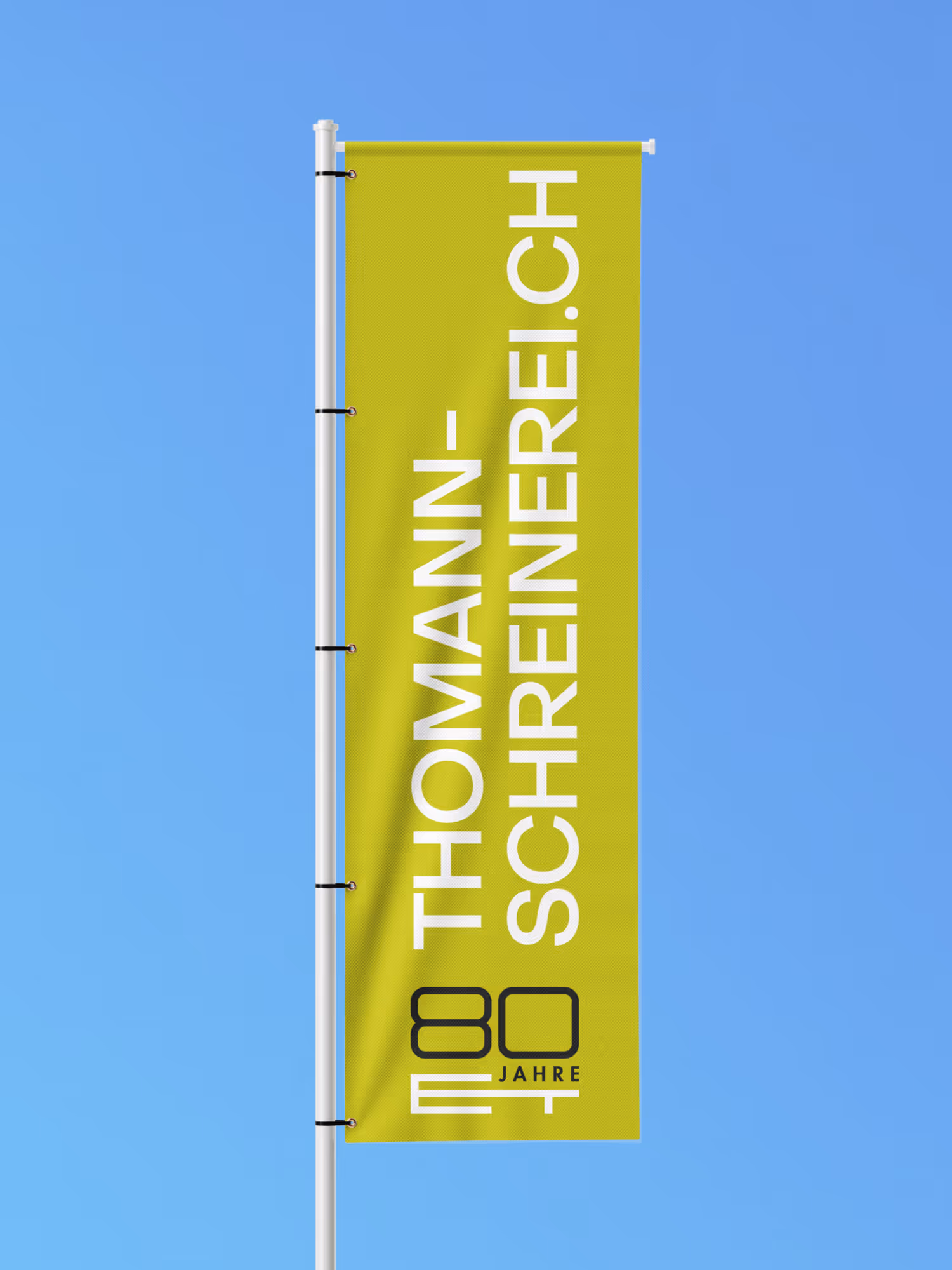
Thomann Schreinerei has been passionately developing individual solutions for kitchens, windows, furniture and interior fittings for over 80 years. With a dedicated team of 30 experts, the company focuses on the highest quality and personal support. The aim is to create concepts that are not only aesthetically appealing, but also functional and sustainable.
Category
Trade & Technology
Service
Consulting
Workshop
Conception
Corporate Design
Communication Design
Digital Design
UX & UI Design
Web Development
2D Animation
Partner

Starting Point & Goals
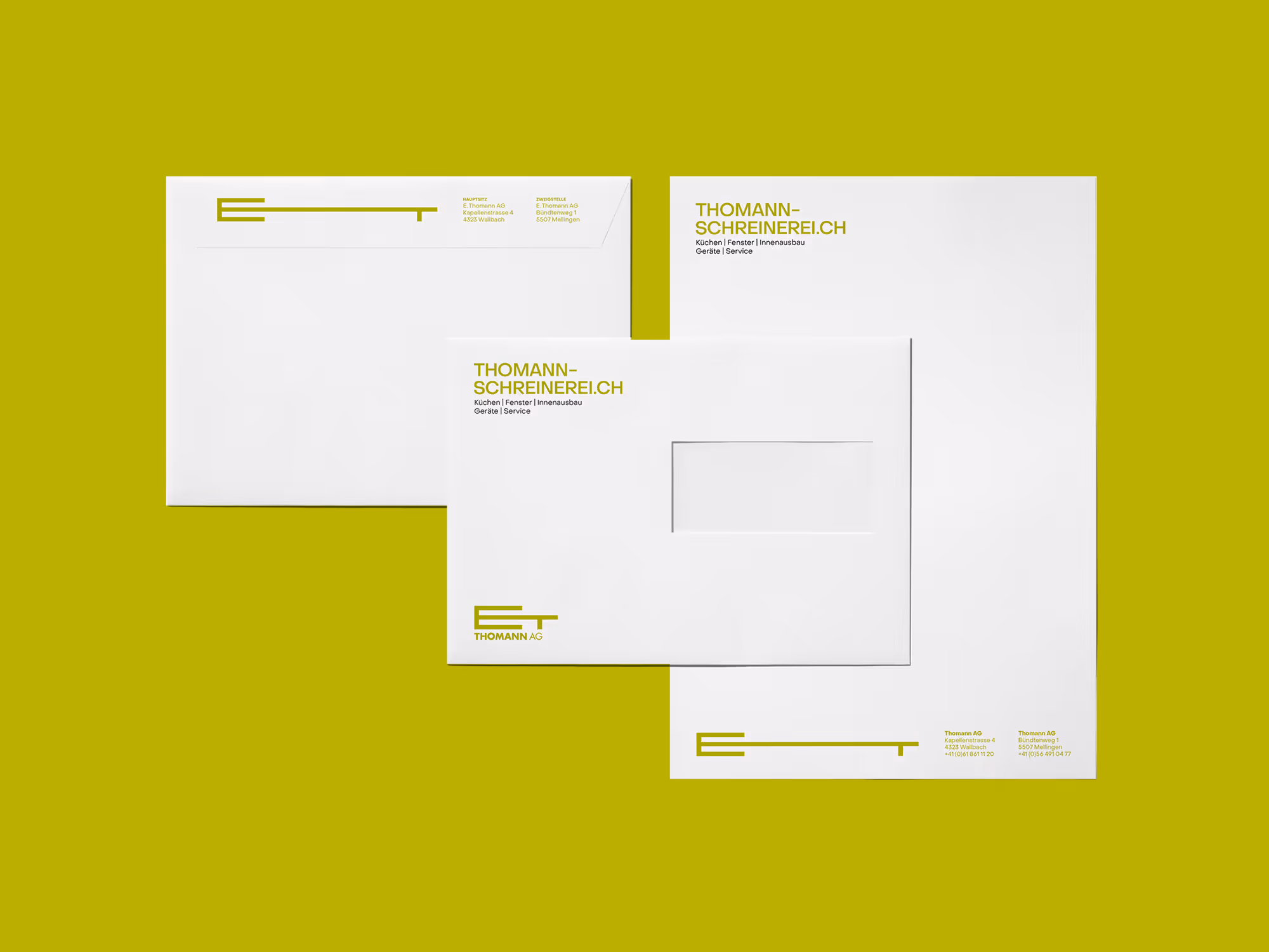
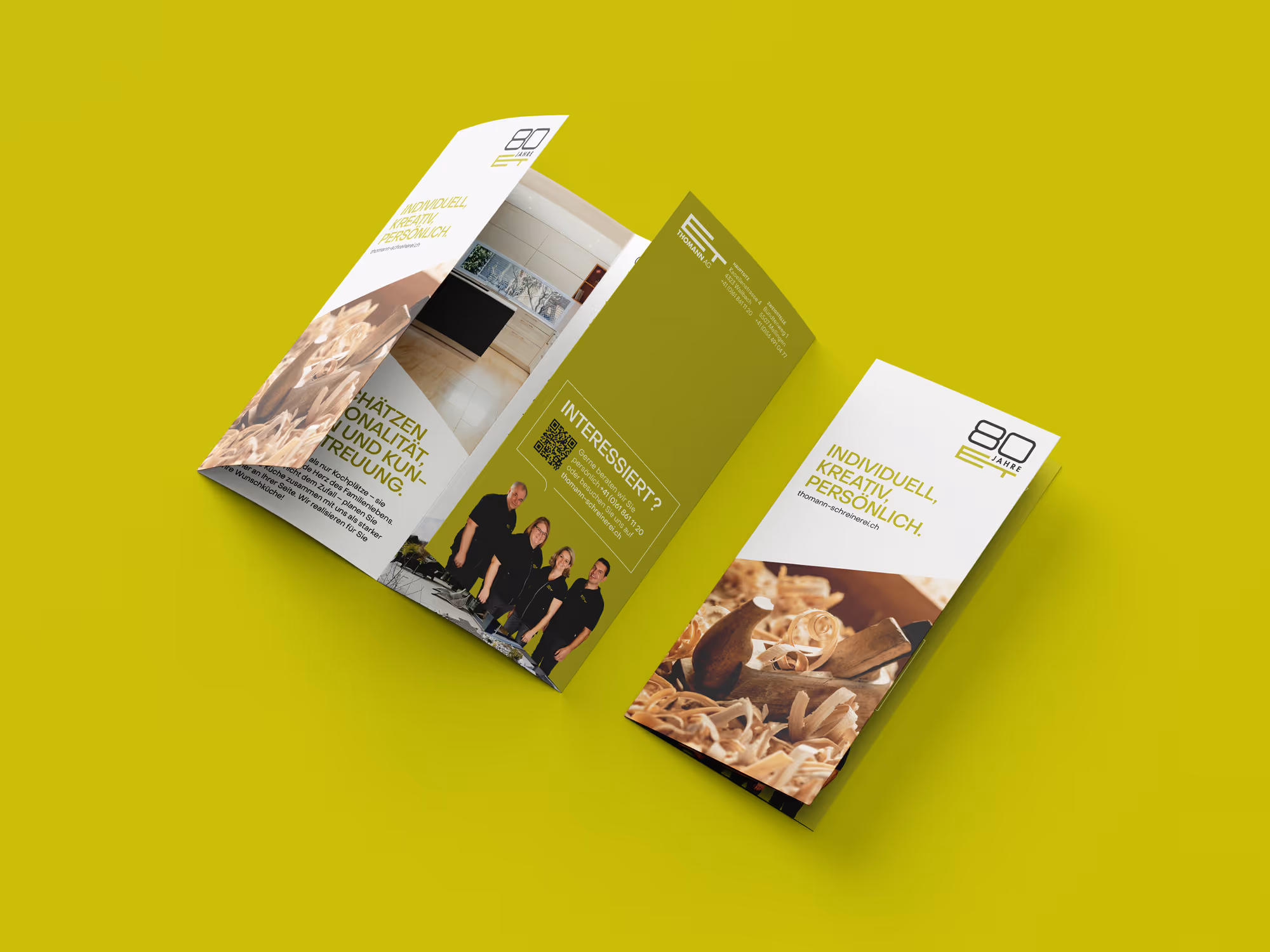
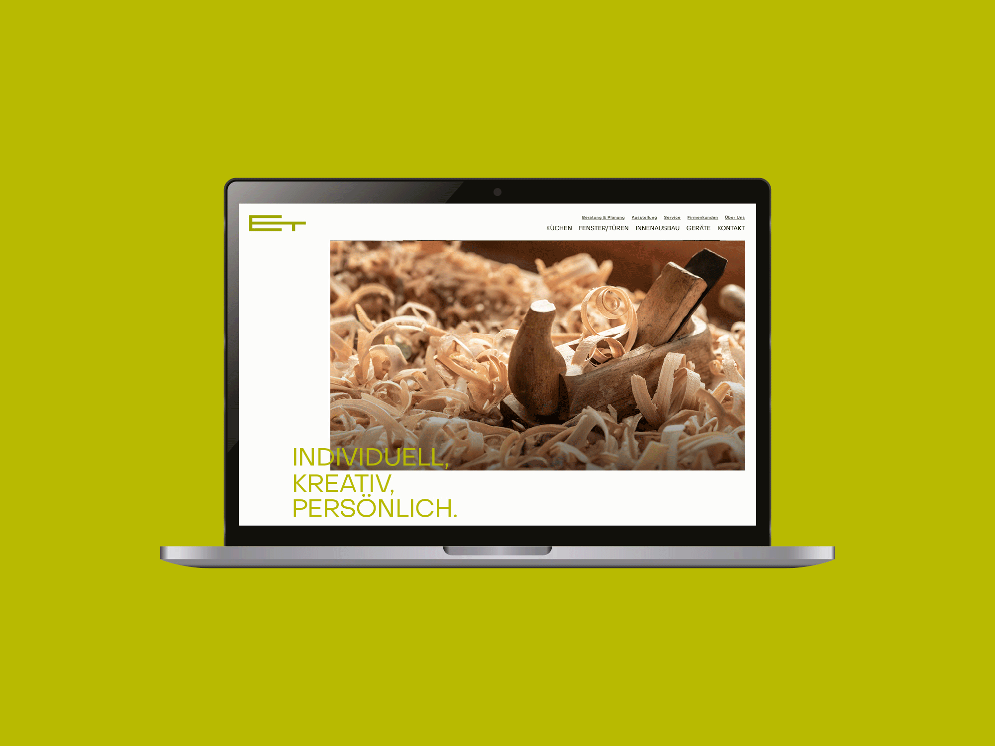
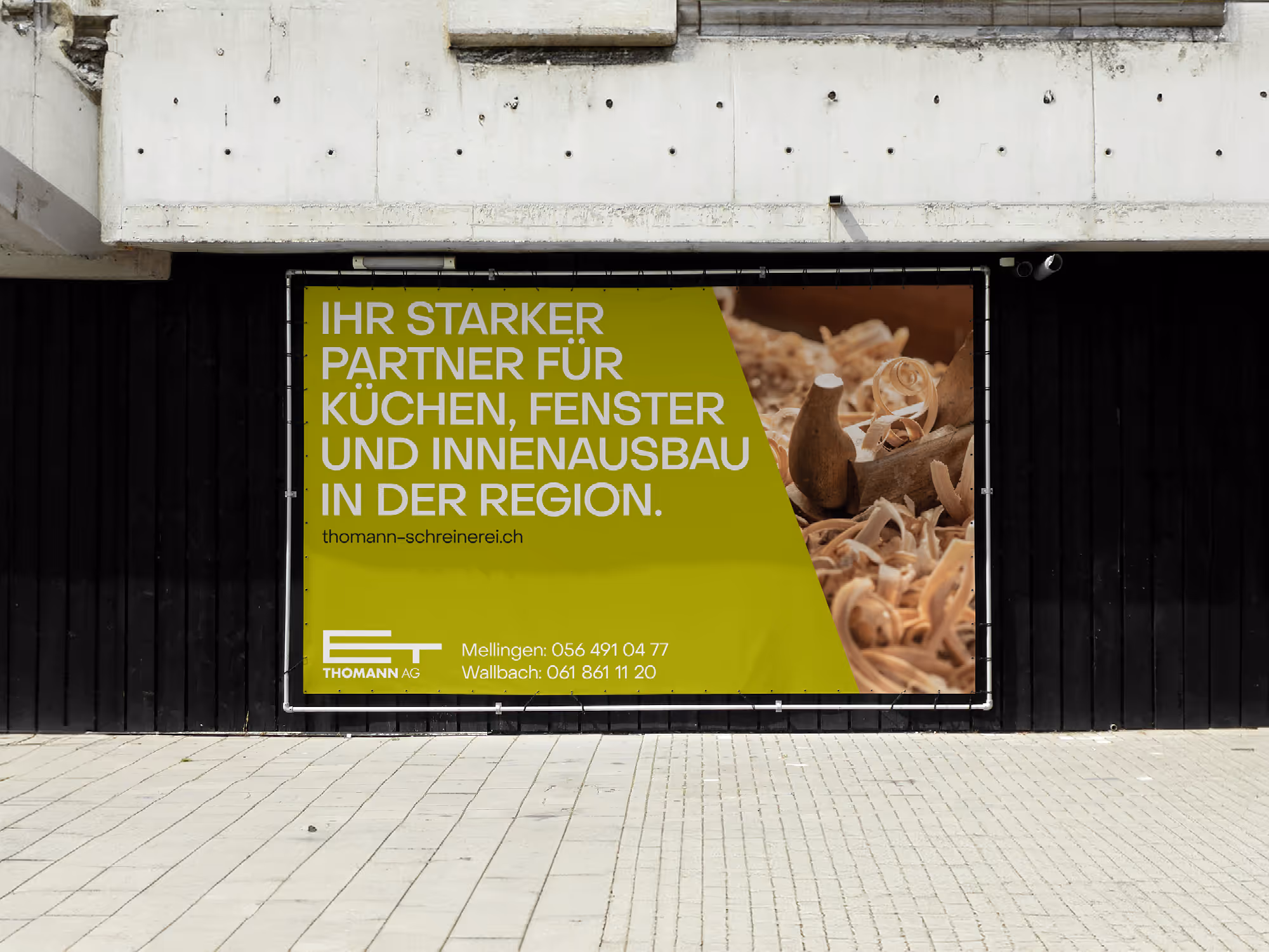
The starting point was Thomann AG's request for a new website. During the process, however, it quickly became clear that a pure website redesign was not enough: a uniform brand presence was missing. The focus therefore shifted to a holistic overhaul of the brand. The aim was to make Thomann AG's central strength visible — its in-house joinery. In contrast to the competition, Thomann creates tailor-made kitchens and interior fittings from a single source. The new brand identity should clearly convey this attitude, while at the same time appearing more personal and creating closeness. The existing logo was retained as a familiar element.
Implementation & added value
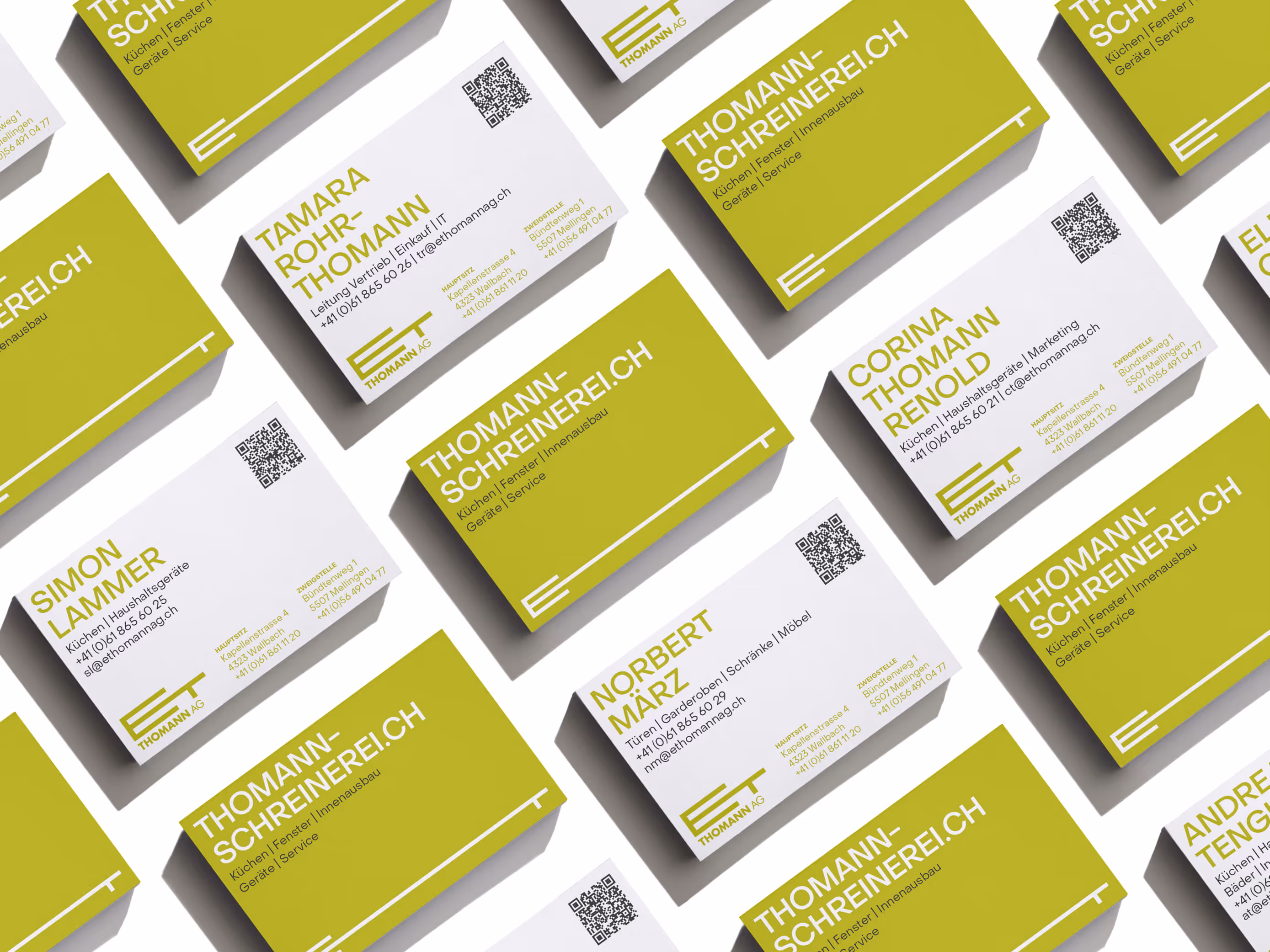
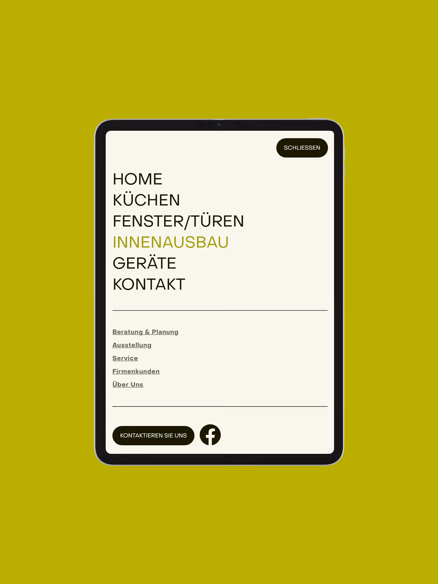
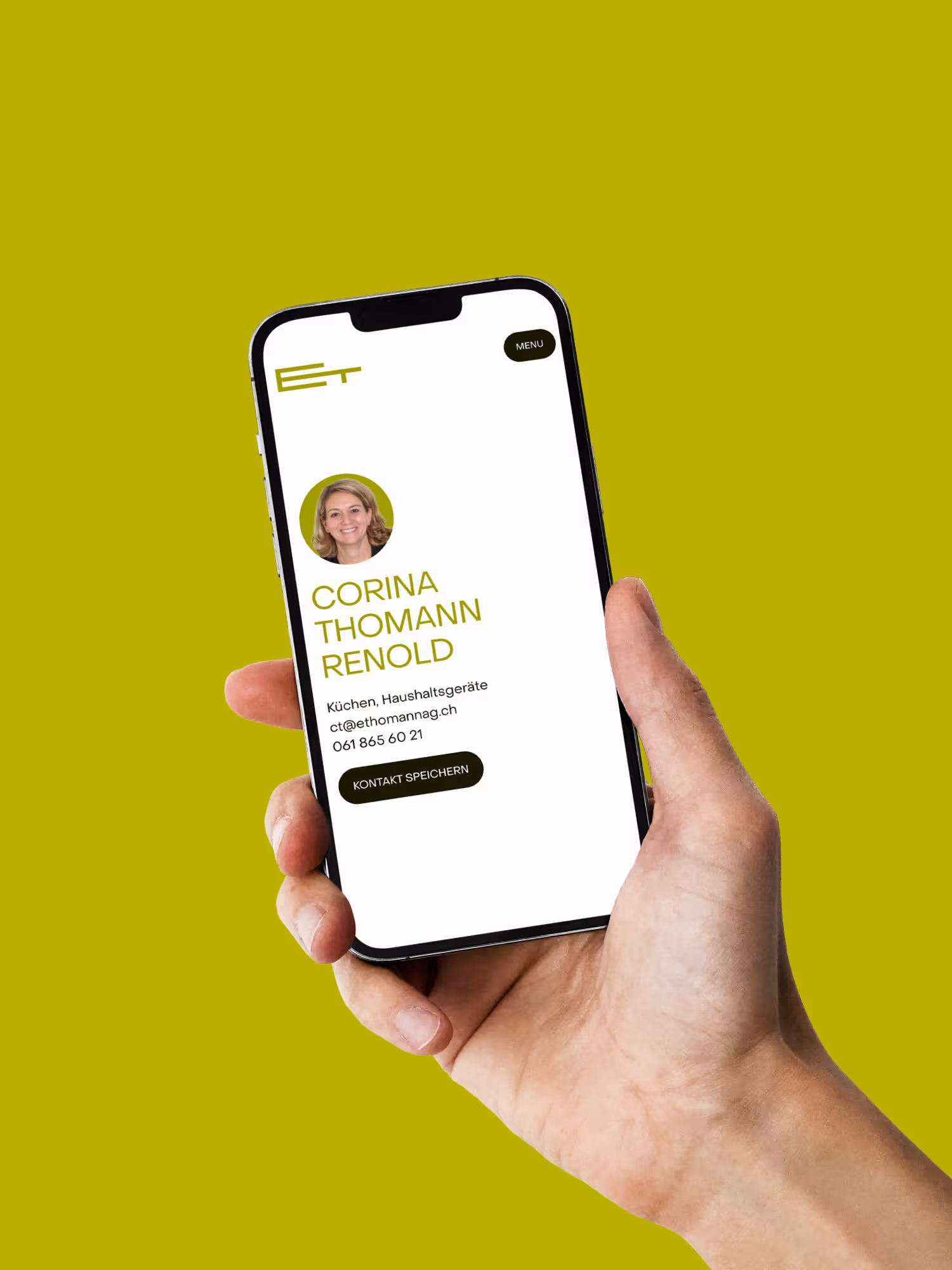
In the workshop, we defined a clear brand message as well as colors and fonts as a reliable basis for all applications. The logo was not reinvented, but rather rethought: Today, it works like a tape measure, can be used flexibly and symbolizes tailor-made solutions from our own joinery. The website was structurally rebuilt and designed for comprehensibility and proximity. Personal quick tips provide insights into the team's everyday life and know-how. Supplemented by digital vCards with QR codes, contact data can be transferred directly to the smartphone. This creates a brand identity that clearly combines craftsmanship, personality and utility.